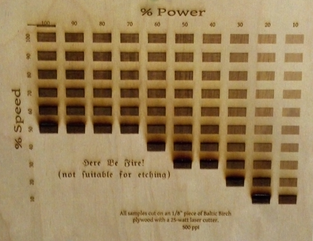
So, I was just getting in to the ‘Space when Jason G. and I started talking about the laser cutter. I had planned on doing some simple tests to determine the level of shading that I could get for an as-yet unnamed project when he mentioned that he (and others) were talking about doing a full map of different settings and the results.
I thought that I might as well give it a shot. The set up was interesting. I created a grid of rectangles in CorelDraw (oh, how I hate you!) and then used the preferences dialogue in the laser cutter driver to adjust the speed and power for each little square.
I should explain that the driver recognizes 8 colors and for each color in your image you can assign different settings. It was a little trying given that the grid is 10×10 but, eight at a time, I assigned the appropriate colors, then settings and let it cut.
After the charring became significant on the low speed/high power settings, I decided to omit the rest of them because, honestly, who wants their project to turn into charcoal? If you can’t read the Olde English font, it says, “Here Be Fire! (not suitable for etching).”
As you can see, there is a very nice gradient that results from many of these settings used in conjunction with one another. I also left the tar/smoke-damage on because I wanted people to know what their project would look like immediately after using these settings. I suspect that most of that can simply be sanded off.
I had forgotten my camera, but a big thanks to Kevin B. for taking a few shots and emailing them to me via his phone.
Next, a cutting template similar to this one. Oh, and a gradient rainbow. Yeah, a monochromatic, smells-like-a-forest-fire rainbow should do the trick. Maybe I’ll even make it a double. :)
Thanks for the template! It was nice to have a quick reference for guestimating when I was etching my motor controller case. Now we need to make a Reference Guide for Acrylic!
regarding your laser template for power settings. That is a great idea !!
is that something you might share?
Technically, yes. The file is at the Makerspace currently, but I can email it to you when I get in next (might not be for a week).
I had to do a lot of deleting and such since our laser only offers 8 different colors, so I had to recolor each square, 8 at a time, adjusting power and speed settings for each one. What sort of file format do you need?
Shane!!! Please send me your file! I need it so badly. I’m using Corel X7. I have been looking for something like this for quite some time. We have several lasers and each one seems to be slightly different. You would be my hero if you could share your file. Much thanks in advance.
This would be very handy. Can you email me the file for my corel x7 please? I would really appreciate it!
Please send a copy of the file, we just picked up a 80 watt unit, and this will save us a bunch of time! Thanks
Just getting up and running with a laser cutter at a local Makerspace here and would also love a copy of this file. Thank you!
Is it possible to get a copy of this template. I am trying to test setting and this would be perfect.
Thank you
I would love a copy of your Template if you are sharing it.
Hi Shane,
I just stumbled on this, could I have a template too!? DFX file is probably best right? Thanks
Juliette
Can somebody send me this file?
I am very geeen when it xomes to laser engraving could you please send me the template. It would greatly help..Thanks
This is excellent and just what I have been looking for, however, I am yet to find the colour palette for the Chinese 40W CO2 laser within Corel or on the install disk.
Any guidance would be greatly appreciated
Is it possible to get a copy of this template. I am trying to test setting and this would be perfect.
Thank you
Brilliant Idea, I have a new cutter sitting here and was deciding on how to procede. I think this is my 1st project so I can dial in the settings, THANKS
This is a terrific tool for those new to laser engraving. Do you have a website where this can be purchased or downloaded? I’d like to get a copy to use with my new 45W unit.
Very nice and useful template.
I use it for my 3w blue laser to test different materials
Wonderful template.
Where i can download it?
thx